Mobile charts within surveys
What the Chart Question Does
This guide covers the Chart question type, which appears inside a survey. For charts of scored answers that participants open from the survey card, see Mobile charts for participant progress.
A Chart question shows participants a bar graph of their own answers to an earlier Multiple Selection question in the same survey, built up across everything they have submitted so far.
It is there for the participant rather than the researcher: in an experience sampling (ESM) or ecological momentary assessment (EMA) study, it lets them see their own patterns as the study runs — how often they chose each option, as a count or a percentage.
Setting Up the Chart
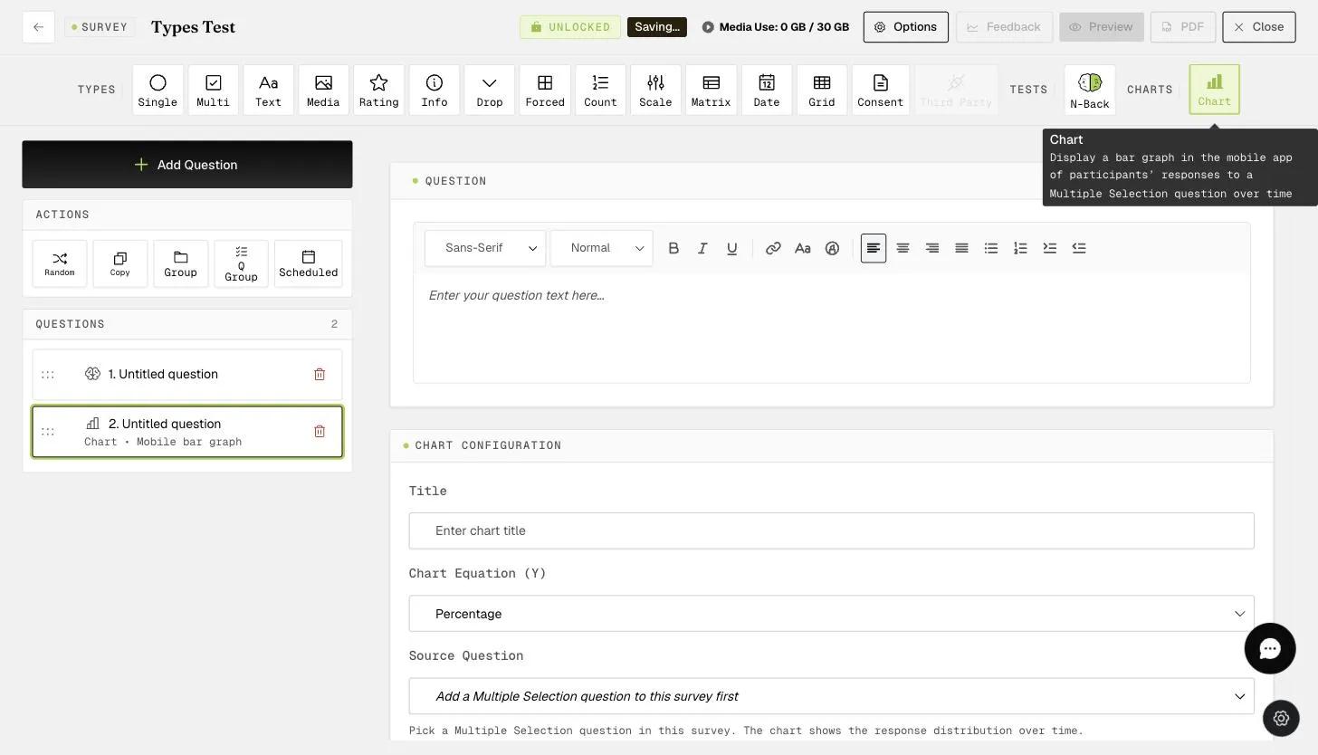
Add a question and set its type to Chart, then fill in the Chart Configuration panel:
-
Title — the heading shown above the chart on the participant's phone.
-
Chart Equation (Y) — Count plots how many times each option was chosen. Percentage plots each option's share of submissions.
-
Source Question — the Multiple Selection question the chart reads from.
-
X-axis Label and Y-axis Label — the axis captions. The X-axis lists the response options, so name the category there; the Y-axis carries the number.
A Chart question can only read from a Multiple Selection question in the same survey. Place the chart after that question so the current submission is counted too.
For Percentage, the denominator is the number of submissions to that question rather than to the survey, since a participant can skip it. Count has no denominator — it simply totals how many times each response choice was selected.
A survey can hold more than one chart, each reading from a different Multiple Selection question.
What Participants See
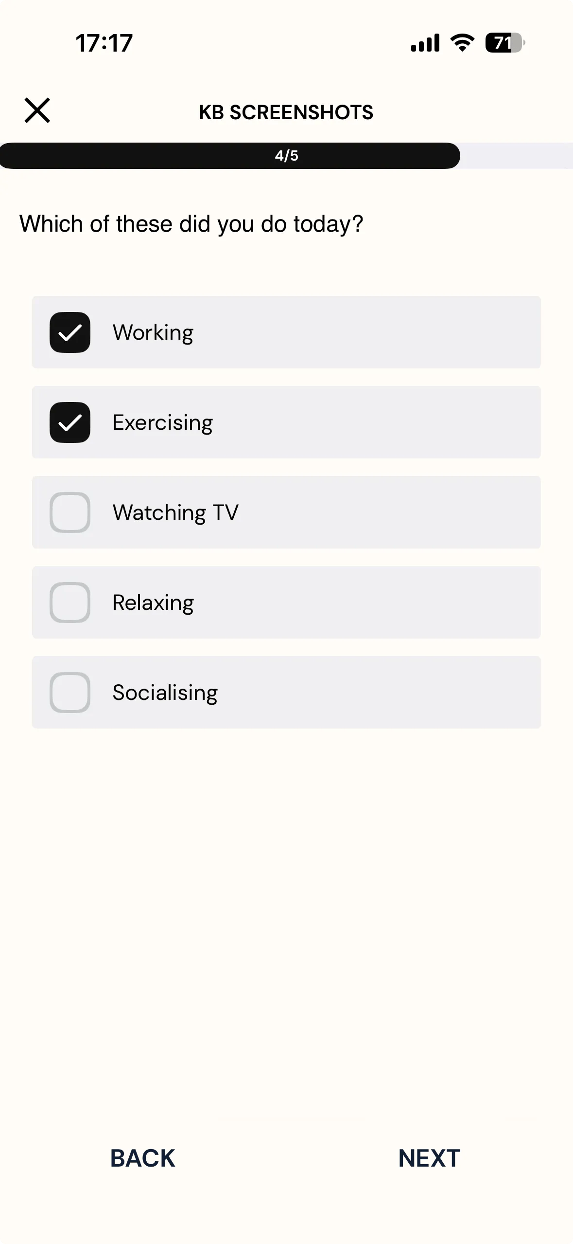
Participants answer the source question as usual.
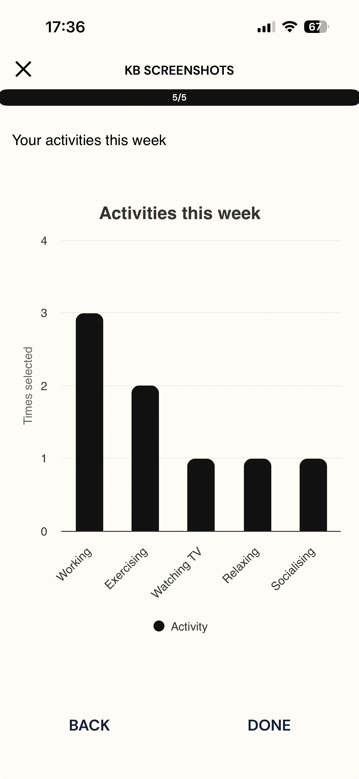
Further on in the survey, the chart shows those answers accumulated across all their submissions — so someone who reports working most days watches that bar climb while the others stay low.
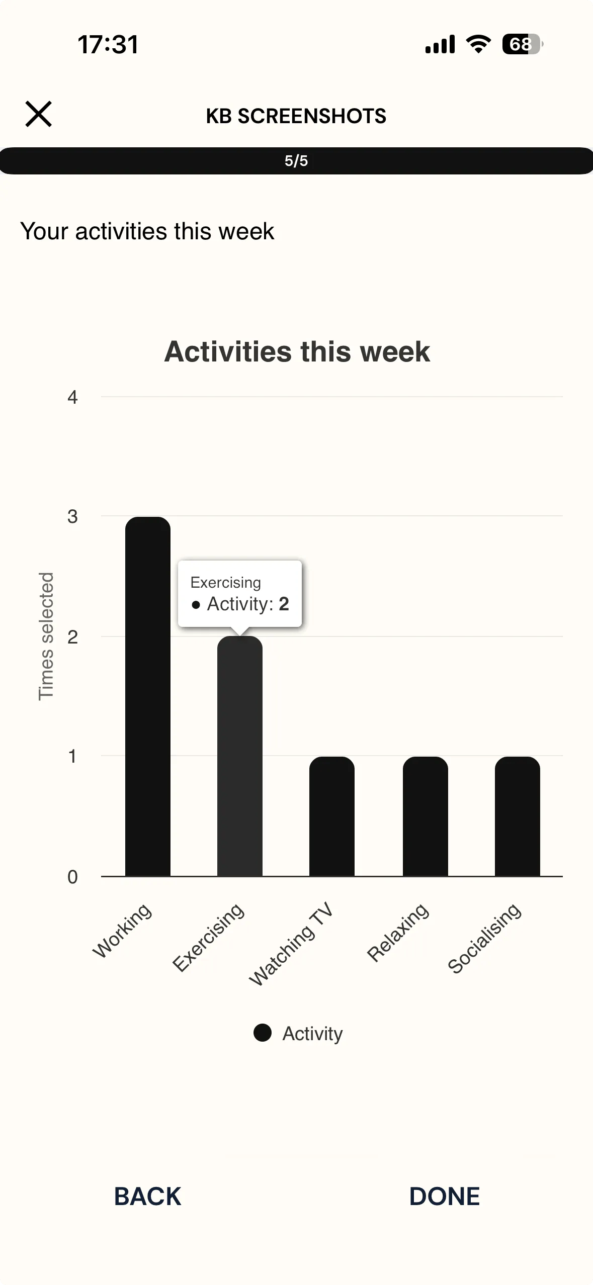
Tapping a bar shows its exact value.
The chart only ever shows that participant's own responses. It counts their earlier submissions plus the answer they've just given in the current survey, so even a first-time participant sees their own answer counted. Counts build up across submissions, so the chart becomes more informative the longer the study runs.
For further inquiries, please reach out to help@expiwell.com