Access mobile charts
If your research team set up charts, the app can show you graphs of your own answers. They come in two kinds:
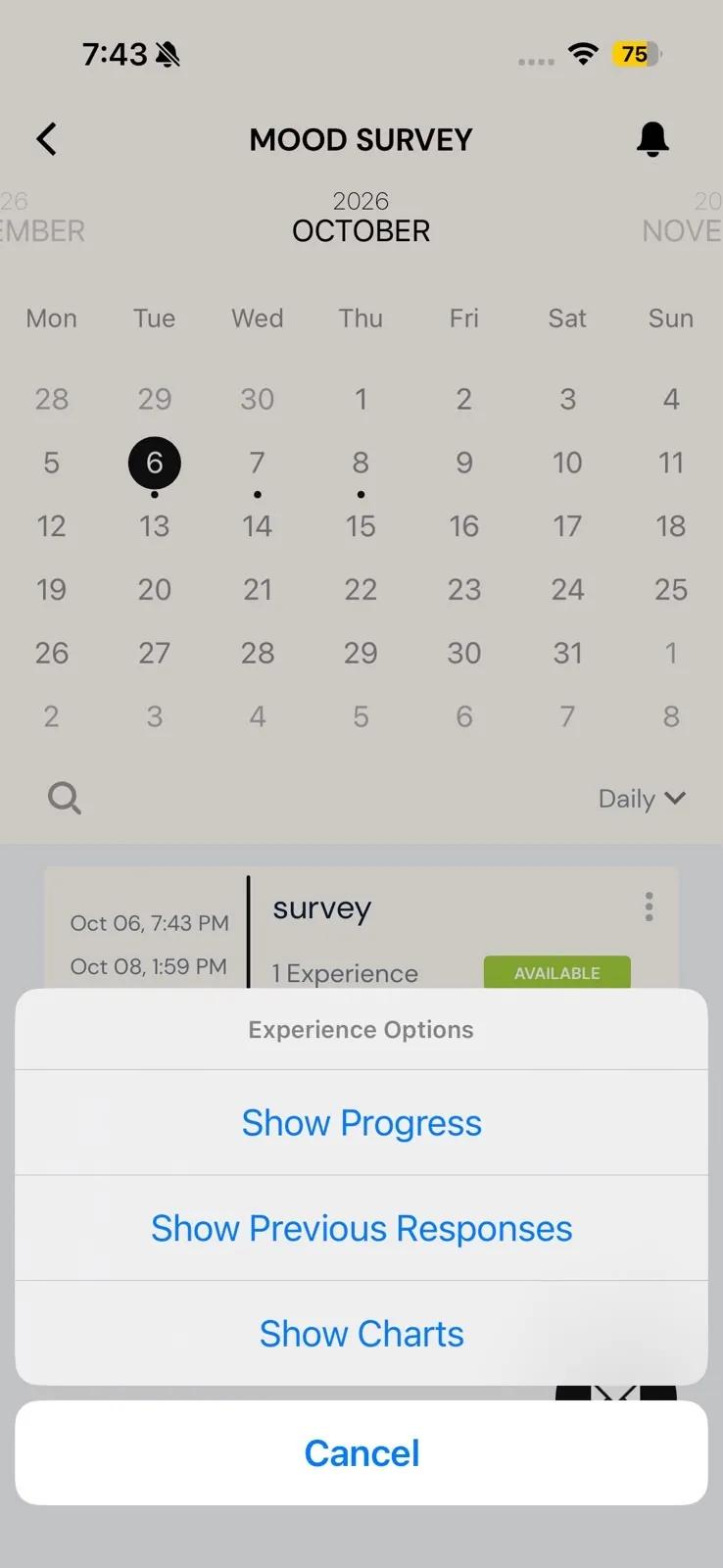
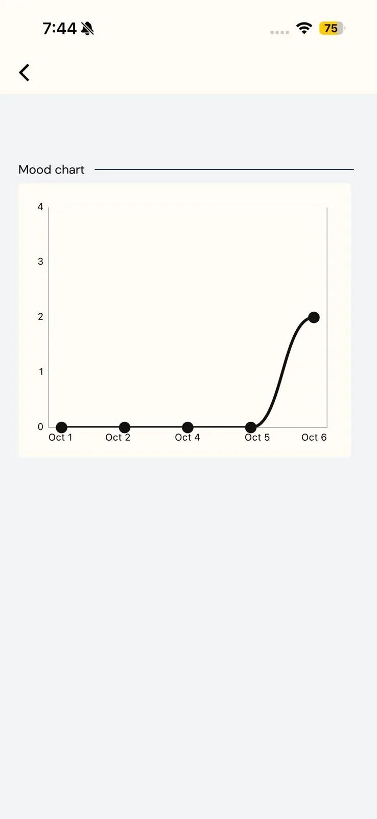
- Progress charts: line charts of your scores over the past few days. You open them from a survey's options menu with Show Charts.
- Chart questions: a bar chart that appears as a step inside a survey, showing how often you've picked each answer to an earlier question.
Charts only show your own answers. Other participants never see them, and you never see theirs.
Show your progress charts
- On the Current tab, tap the study's card to open it.
- Tap the ⋮ icon on a survey's row.
- In Experience Options, tap Show Charts.
Each chart has the title your research team gave it. The days run along the bottom and your score runs up the side. Each point is one day: the average or the total of your scores that day, depending on how the research team set up the chart. A day you didn't answer shows as 0.
Pull down on the screen to refresh it after you submit a survey.
Show Charts appears only for surveys that have charts. The same menu has your progress and, if the study allows it, your previous responses; see Participants viewing past responses.
Charts inside a survey
Some surveys include a chart as one of their steps. It shows a bar for each answer to an earlier Multiple Selection question in the same survey. Each bar counts how many times you've chosen that answer across your submissions, or shows it as a percentage.
The chart includes the answer you've just given in this survey, so you can see it count before you submit.
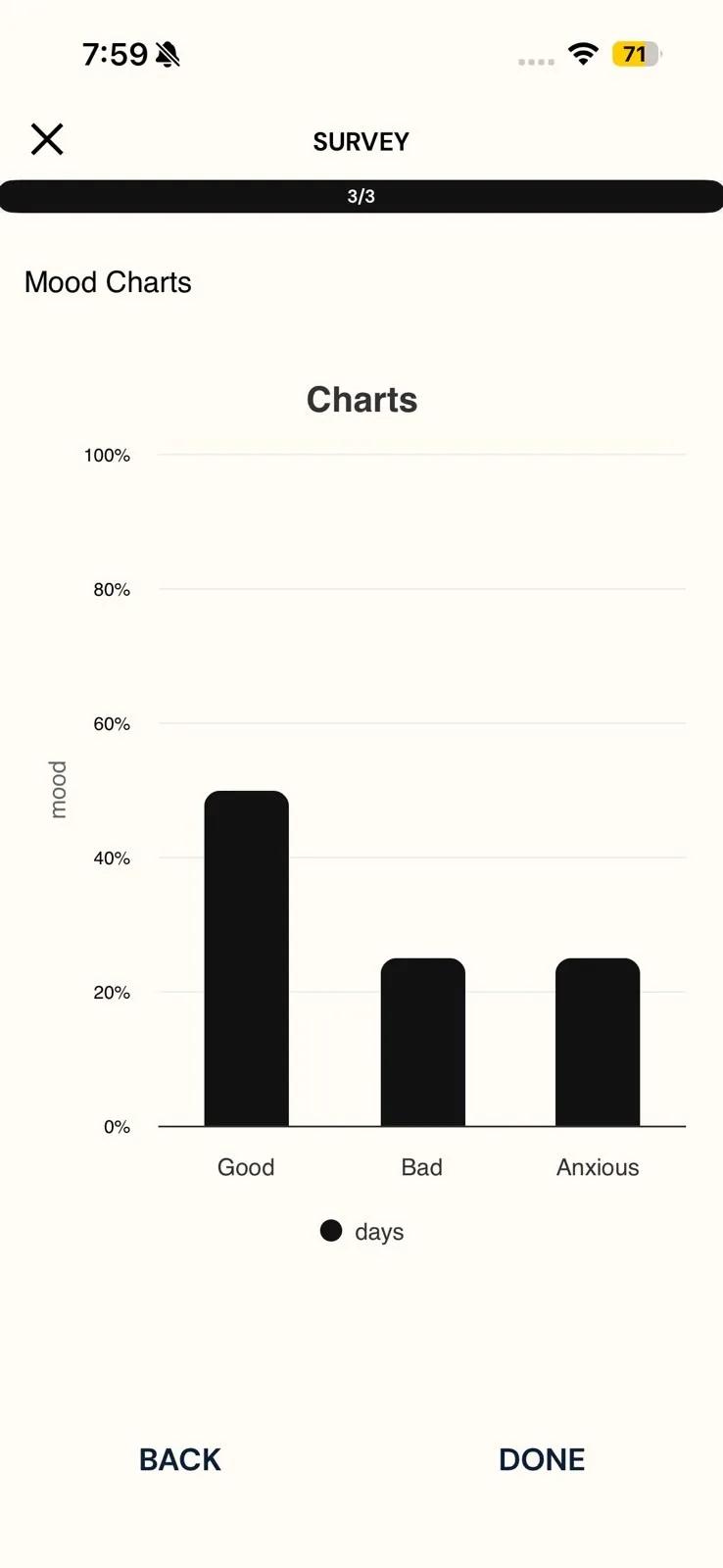
A chart question is part of the survey like any other step. There's nothing to answer on it. Read it, then tap Next, or Done if it's the last step.
Don't see a chart?
- No Show Charts option in the menu: that survey has no progress charts. Charts are optional, and only your research team can add them. There's nothing for you to turn on.
- There Aren't Any Available Charts For This Experience.: there's nothing to plot yet. Submit the survey, then pull down on the charts screen to refresh it.
If you expected charts and can't find them, ask your research team; see Contacting the researchers.
Related
- Seeing your previous responses → Participants viewing past responses.
- Managing a study from its card → Experience options.
- How researchers set these charts up → Mobile charts for participant progress and Mobile charts within surveys.